FlyNow Project
UX Section
Solve the problems encountered in the Airline Booking Process from an end-user by creating an online experience that is fast, easy and intuitive: one that’s based on a deep understanding of their target users.
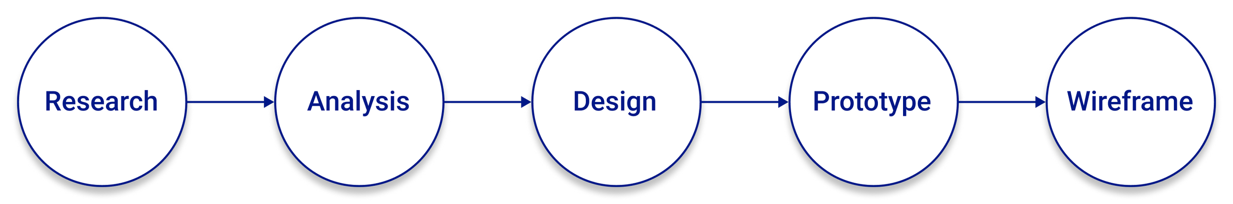
The process will be follow in four phases: Research, Analysis, Concept, Design.
Phase 1: Research
The research phase of the project included four subprojects: Competitive Benchmark, Online survey, Note-taking, and Usability testing.
Competitive Benchmark
Duration: 1 Day Tool: Powerpoint Competitors: 4
The competition needed many improvements...
I selected 3 European airlines and 1 American airline to understand the differences that may exist between airlines from different continents.
A low cost airline was also selected, which was the one with the best behaviours. With this I will be able to study how to solve problems on airlines.
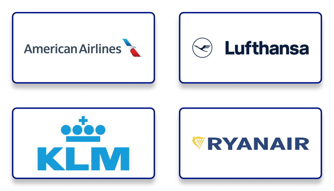
Competitors: American Airlines, Lufthansa, KLM and Ryanair.
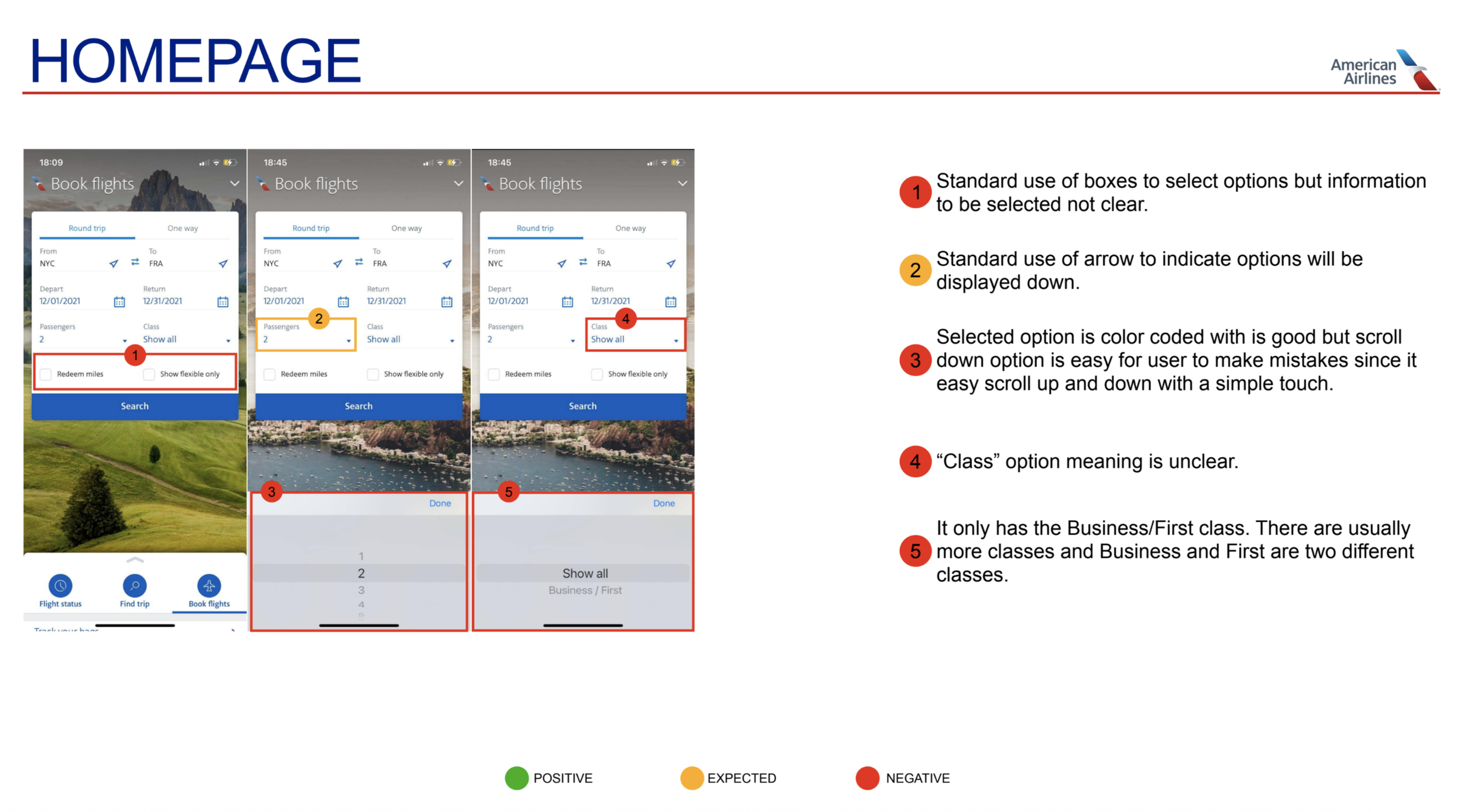
Competitive Benchmark example
Note Taking
Duration: 3 Days Tool: SurveyMonkey Competitors: 26
Although I reviewed different airlines in the previous step I knew that I am not the user, in order to get better insights from the end-user I’ve conducted online surveys with 26 travellers who had trouble booking flights in the past. I’ve asked them questions below to find trends on why they failed at some goals by learning what features they would like to see in an airline, and important factors they consider while booking flights and others.
The notes are written in chronological order and colour-coded to make the information easier to understand.
Key isights
What was done well
• Some Layouts were easy to navigate and very intuitive.
• Iconography and easy language for new users.
• Information on top of screen to help orient the user to which step in the process they are.
• Use of highlighted words and icons to indicate that further steps can be taken if the option was selected.
What should be avoided or improved
• Unclear presentation.
• Icons with no legend.
• Inflexible process with no go back options.
• Unclear typography and color-coding along the process.
• Unnecessary data and cluttered screens.
Online Survey
Duration: 3 Days Tool: SurveyMonkey Competitors: 26
Although I reviewed different airlines in the previous step I knew that I am not the user, in order to get better insights from the end-user I’ve conducted online surveys with 26 travellers who had trouble booking flights in the past. I’ve asked them questions below to find trends on why they failed at some goals by learning what features they would like to see in an airline, and important factors they consider while booking flights and others.
Research Questions:
When was the last time you visited an airline website or app?
Why did you visit the airline website or app that day? What were you trying to do? (check flight, check prices, check-in, etc..).
Were you able to complete your tasks that day?
Do you book a flight from the app or the website? Why?
Do you prefer to book a flight directly on the airline app / website or on a search engine (eg: skyscanner, eDreams ...)?
Do you normally create an account with the airline?
Did you need to take excessive steps in order to achieve your goal?
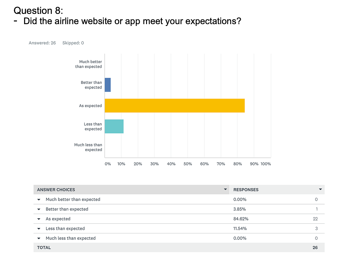
Did the airline website or app meet your expectations?
What was your biggest obstacle during your visit to the flight app or website?
Survey example
Key isights
• On dates selection, both users selected dates from the calendar and not typing dates, in order of departure - return (behaviour).
• Users liked when fares options were visible and clear while selecting flights (positive interaction).
• Users disliked that outbound and inbound information was not clear when clicking on selecting dtes instead it just changes from departure to return with not pop-up screens clarifying the next step (pain points).
• Through the booking process for both airlines, both participants showed that the most important goal for them was not only price, but also timing (goals).
Usability Testing and Depth interviews
Duration: 1 Day Tool: Zoom, ScreenFlow, Reflector 3 Competitors: 2
Although I learned a lot about the user from previous research, doing my own Usability test and Interview was important to gain rich insights directly from the user. I’ve conducted interviews and usability testing with 2 customers from which I learned about the goals and behaviors as well as the context of use.
User 1
Video recording upon request.
Phase 2: Analysis
“It’s only through analysing this data that you can clearly articulate the problems you’re trying to solve for the user.”
Affinity Diagram
Duration: 3 Days Tool: Miro Assistant: Gonçalo
To put structure on qualitative research data and learn the power of collaborative analysis
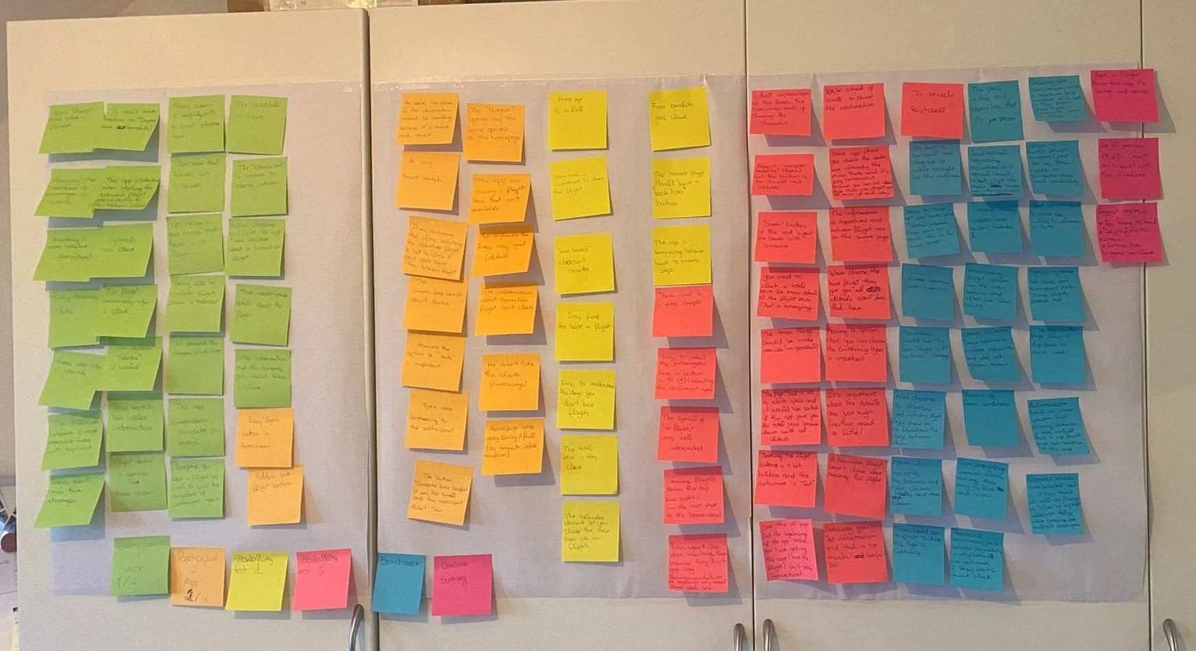
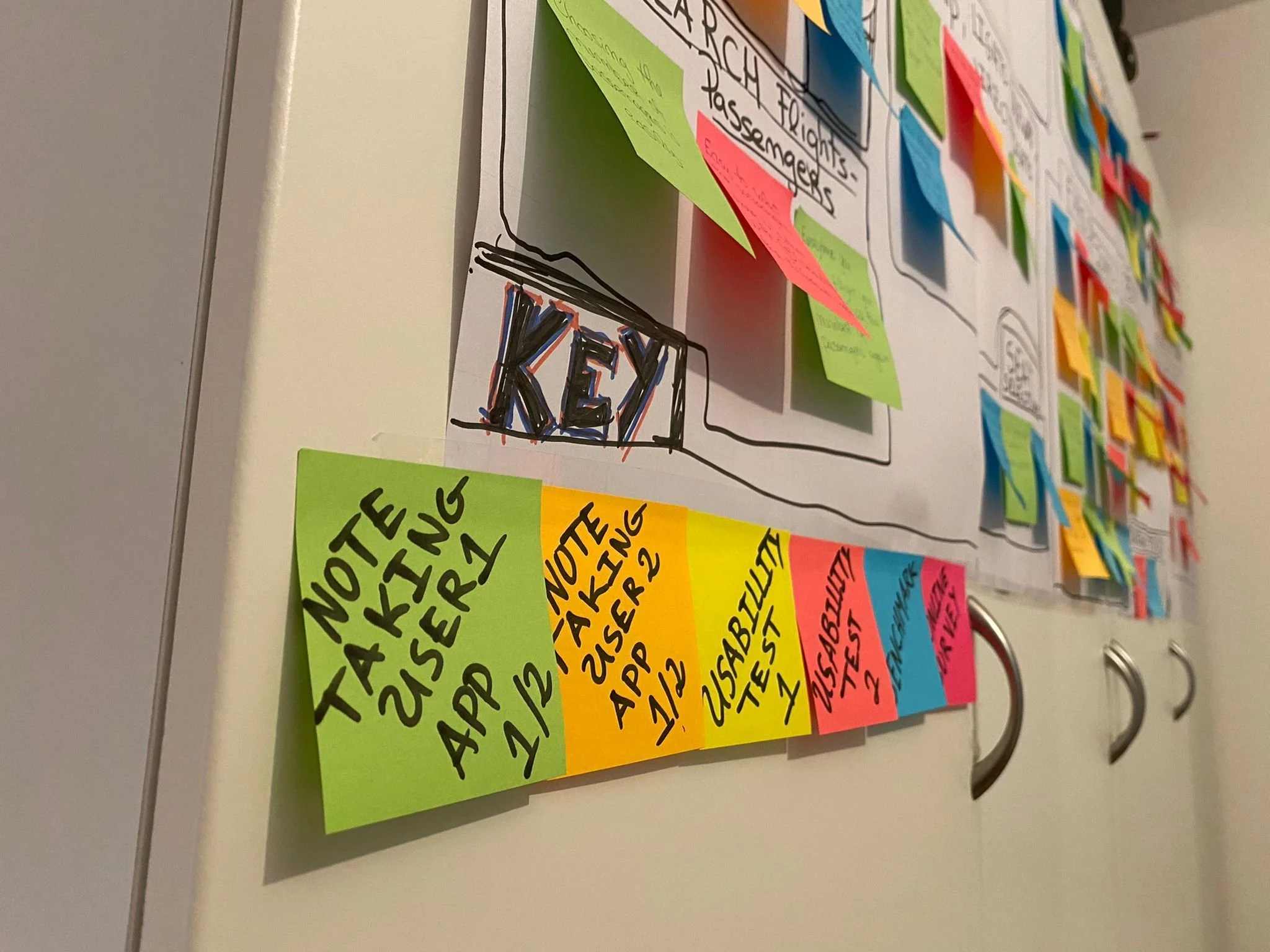
Feelings of confusion came from a clutter of research data collected in the previous phase. Thus, all the information collected was analyzed on Miro, using online sticky notes where each project was color coded and the most important observations, user comments, and annotations, were organized in groups.
Below I'll show you some photos of the affinity diagram development.
I had the help of a friend, as it must be a project developed with more than one person.
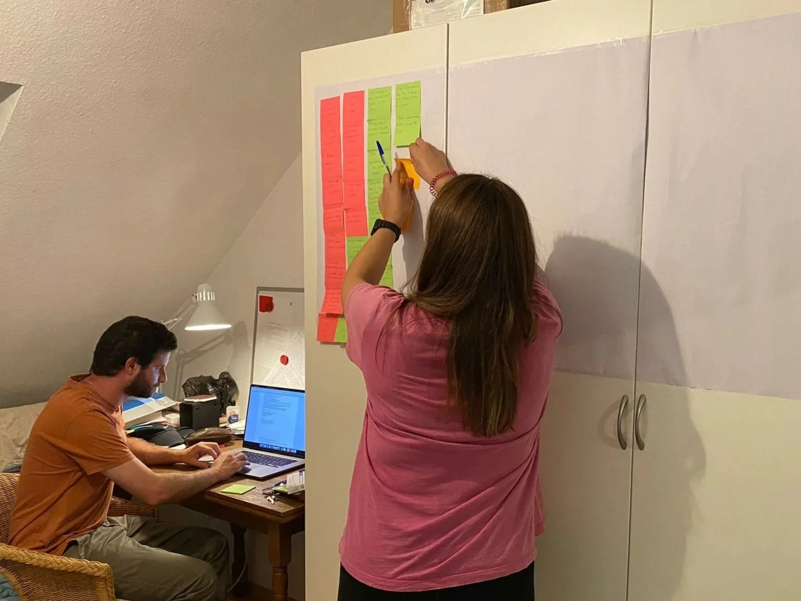
During Affinity Diagram process 1
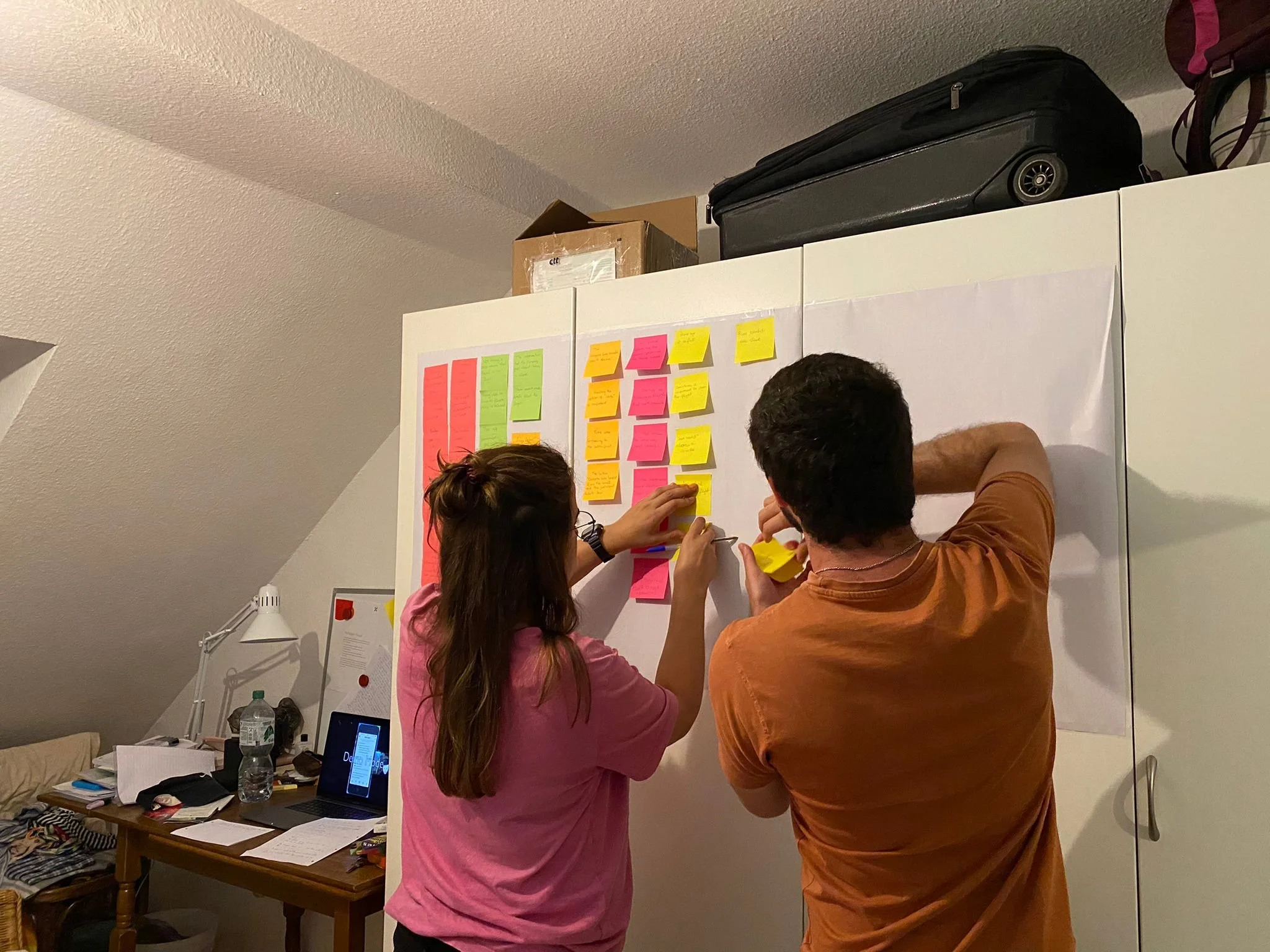
During Affinity Diagram process 2
During Affinity Diagram process 2
Affinity Diagram completed 1
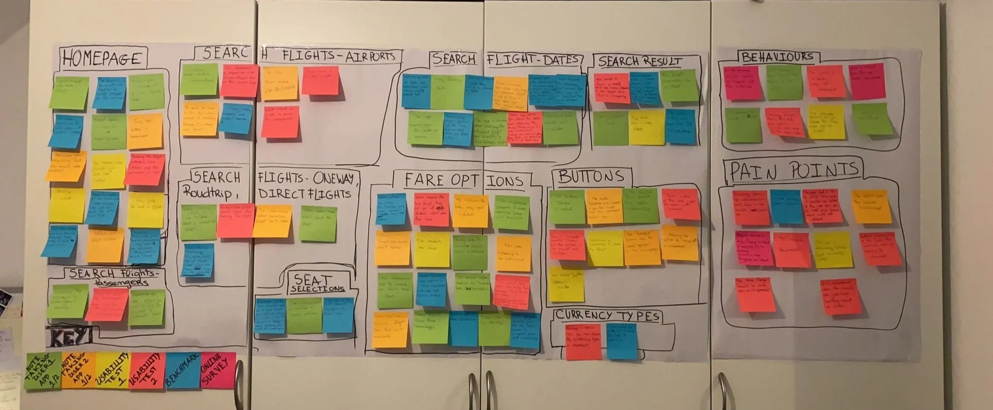
Affinity Diagram completed 2
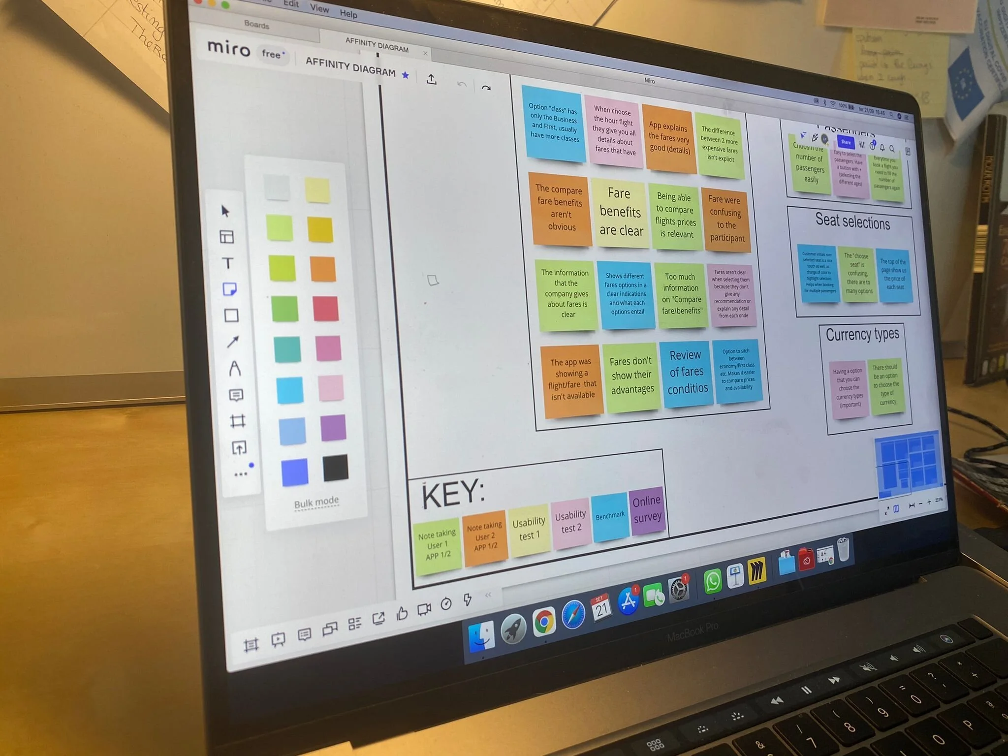
Built in Miro
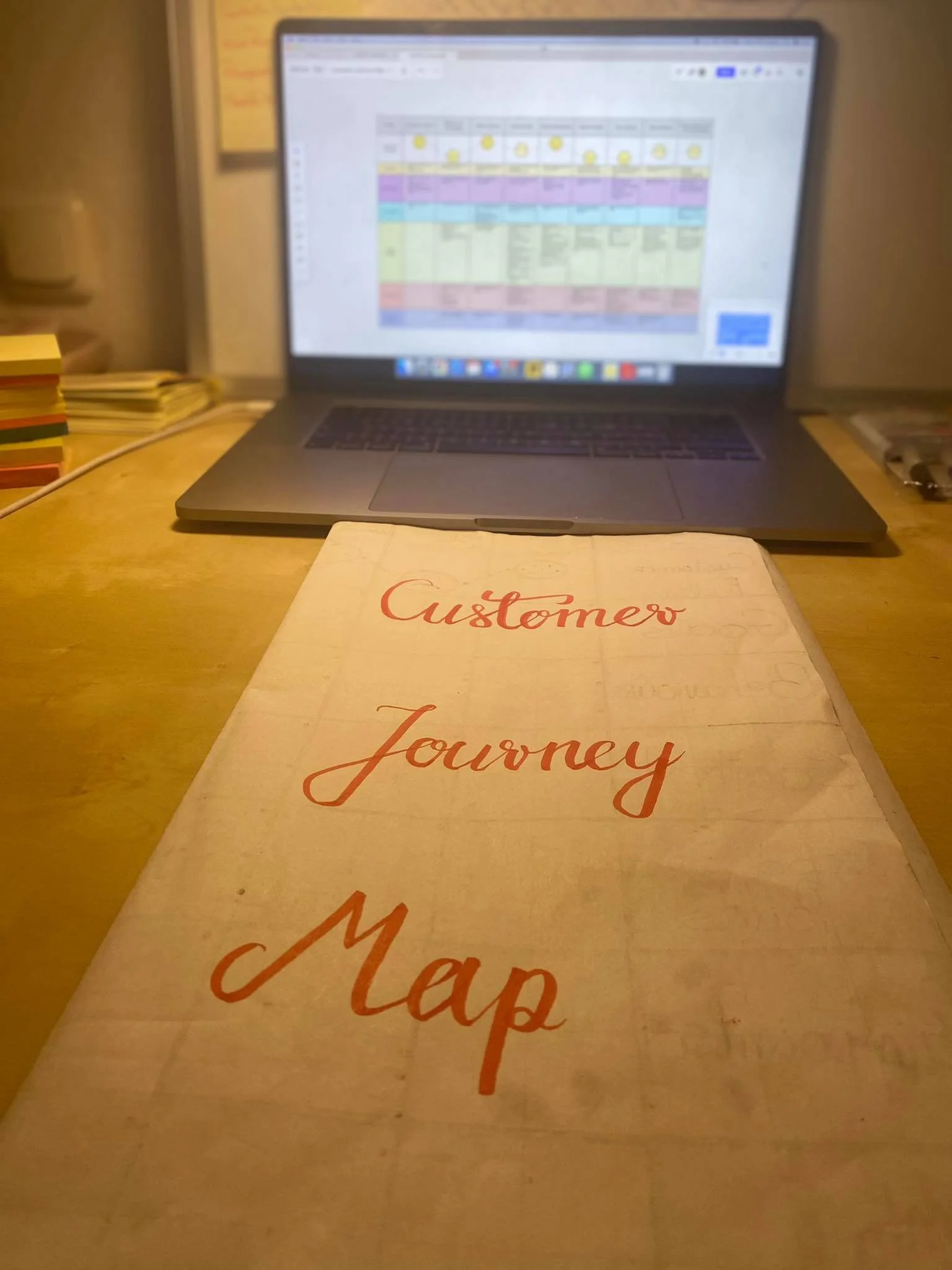
Costumer Journey Map
Duration: 2 Days Tool: Miro Journey Phases: 9
To bring the research data to life by defining the high-level steps in the user journey
After creating the Affinity Diagram, visualizing the journey of the User along the Booking Process became more clear. For each step of the process, I documented the User Goals, Behaviors, Context, Good Points, Pain-points, and Mental Models. Based on all the research each step of the Journey was also represented by the overriding emotion of the User whether it was good, bad, or neutral.
Development the process
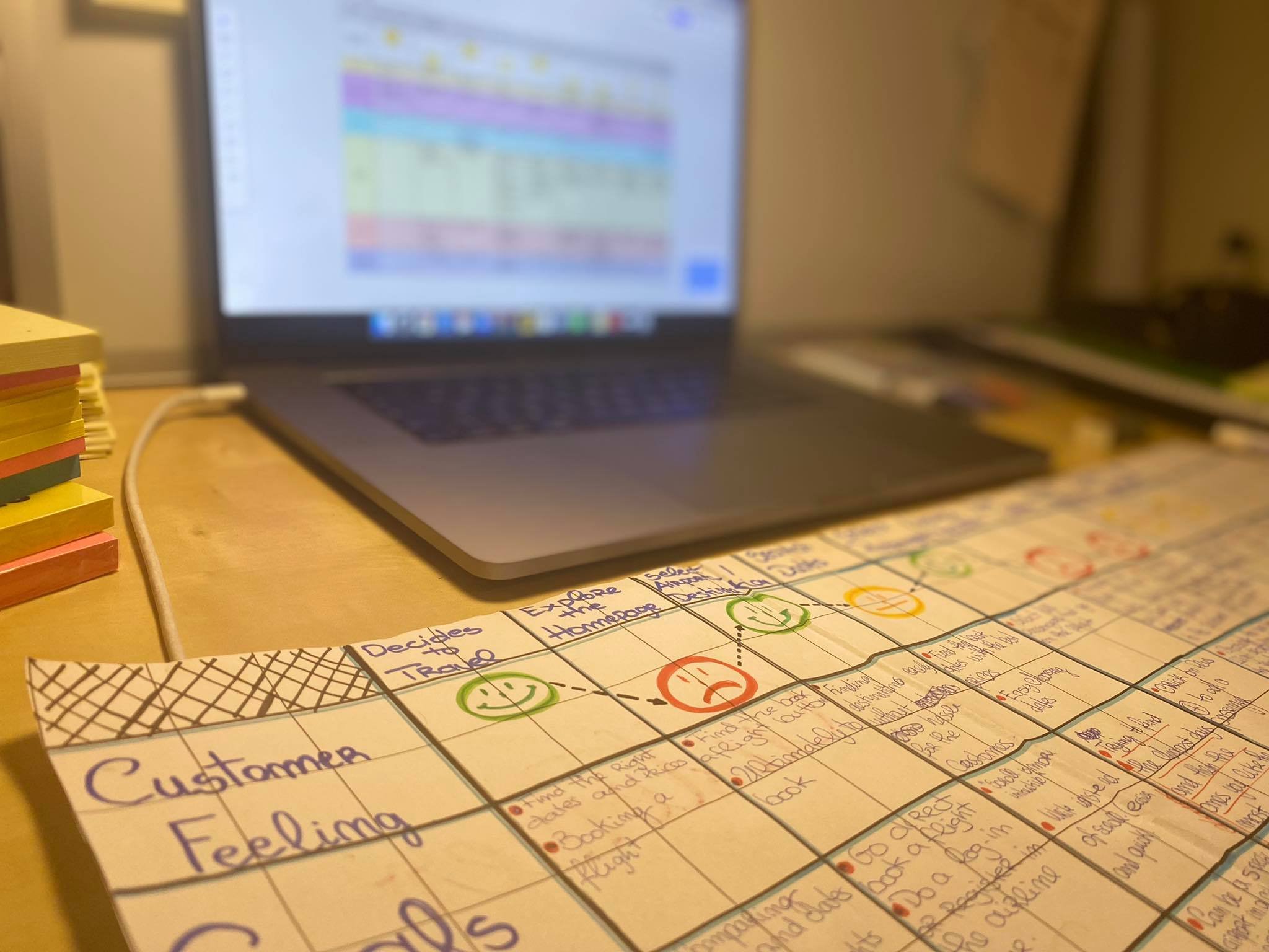
Development the process
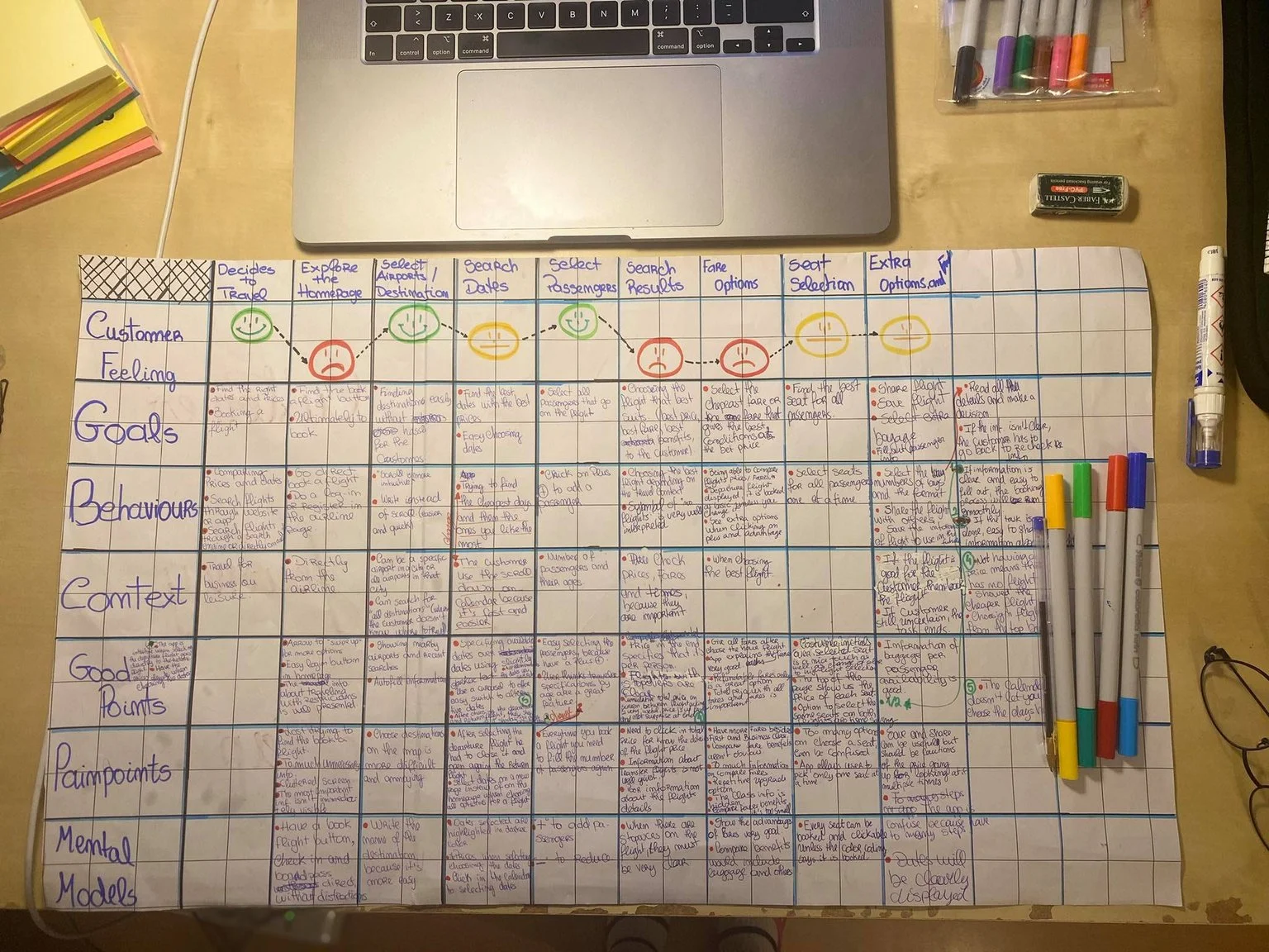
Development the process
Phase 3: Concept
Concept is the first phase of the design process.
Once the research was analyzed and I had a good understanding of the design problem I was trying to solve, I start solving it through two projects: Flow Diagram and Interaction Design.
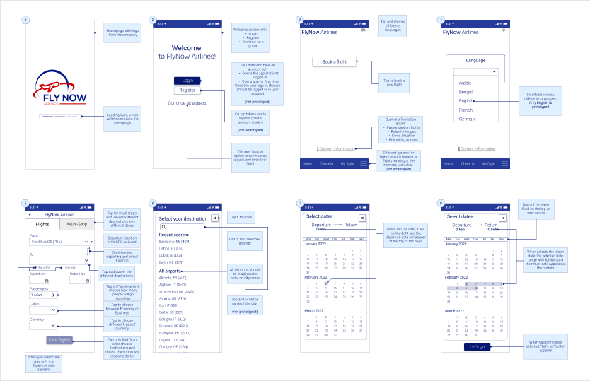
flow diagram for mobile
Duration: 1 Days Tool: Figma
How is the user moving through the booking process?
After defining the problem, I then needed to define the solution. For this solution, I created a Linear Flow diagram for a single-use case using Figma. I make sure I maintained the mental models that users expect while implementing my design recommendations into the interaction flow in order to solve the main user problems.
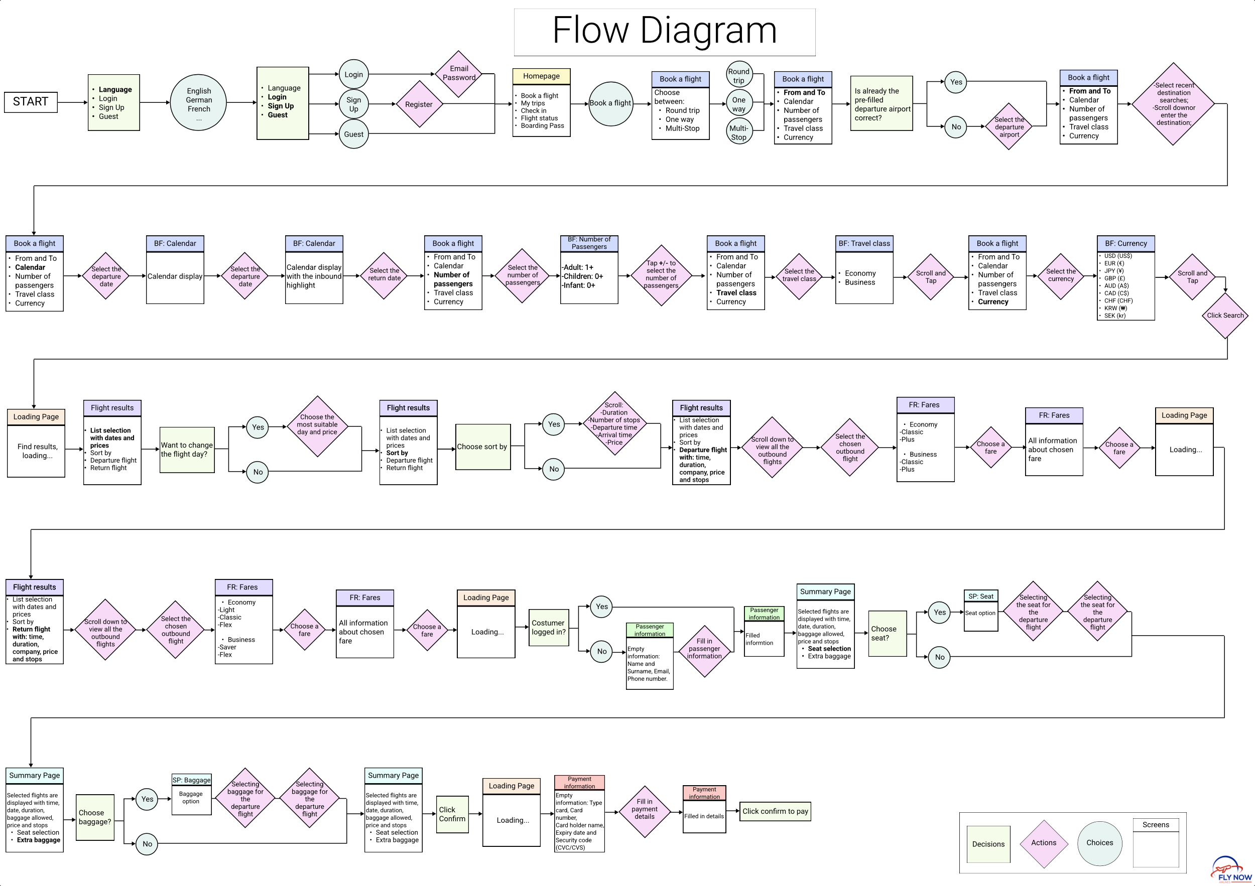
Flow Diagram
Interaction Design for Mobile
Sketching screens and state screens for efficient user flows
Then by addressing the different issues and user goals identified in the research and analysis phases, I started to sketch different UI to design the best visualization of the screens and screen states for users flowing through the airline app.
During the sketch process
Phase 4: Design
Designing solutions to the end user’s problem.
In this final phase of my project, I came up with the digital ideas for what the product might look like and I started building the product and its interactions using a Medium Fidelity Prototype and Wireframes.
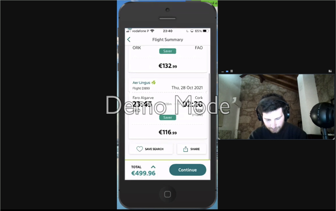
Prototype for mobile
Duration: 1 Week Tool: Figma Screen States: 74
…And it was time to create the preliminary model of the Airline.
Prototyping was a challenge. From learning how to use a new tool, to creating 74 screen states in a week. The main objective of this project was to simulate through a medium-fidelity prototype the appearance of a working app, in order to understand how it works while simulating the interactive experience.
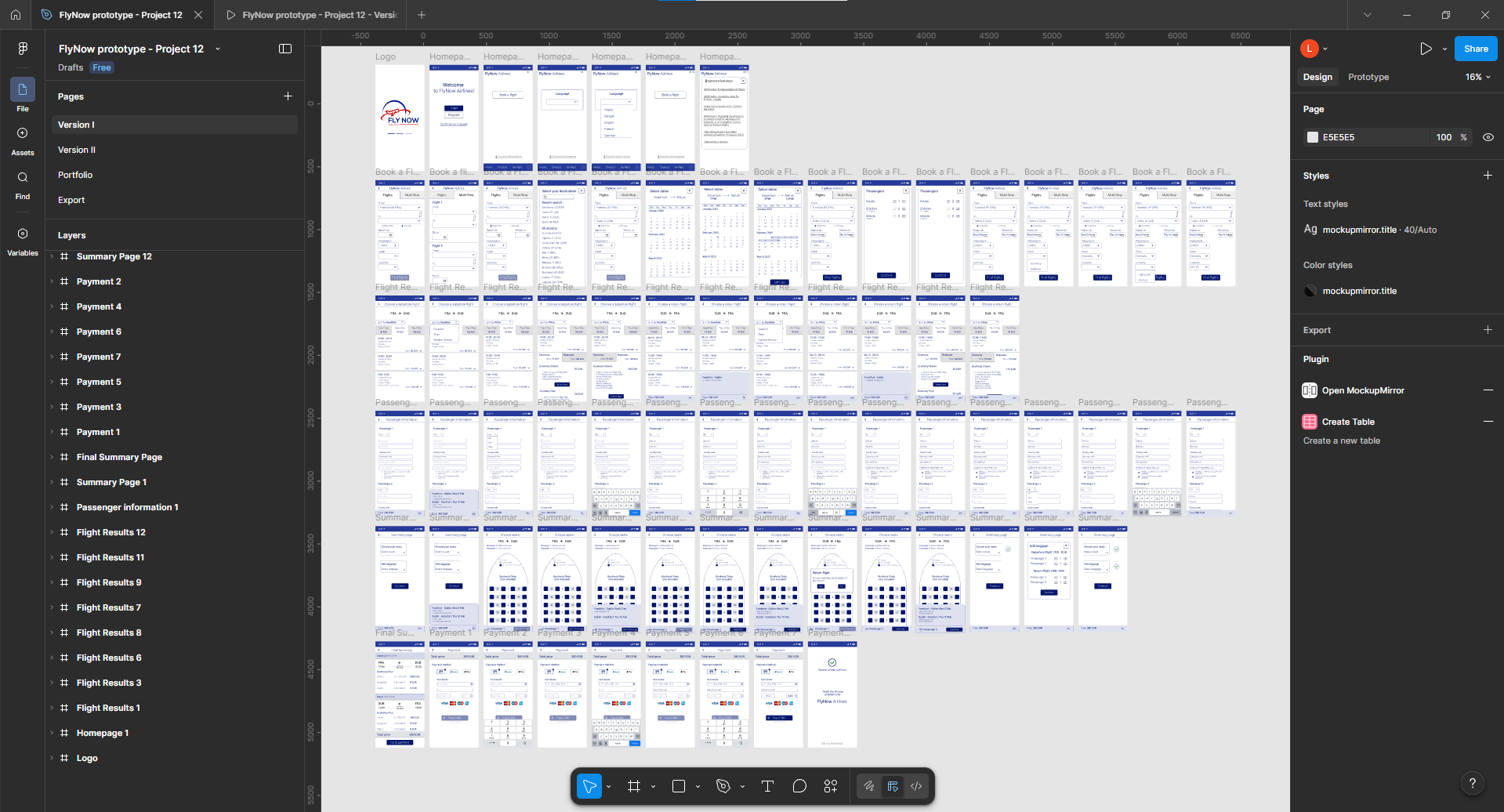
Prototype developed in Figma
You can interact with the prototype below
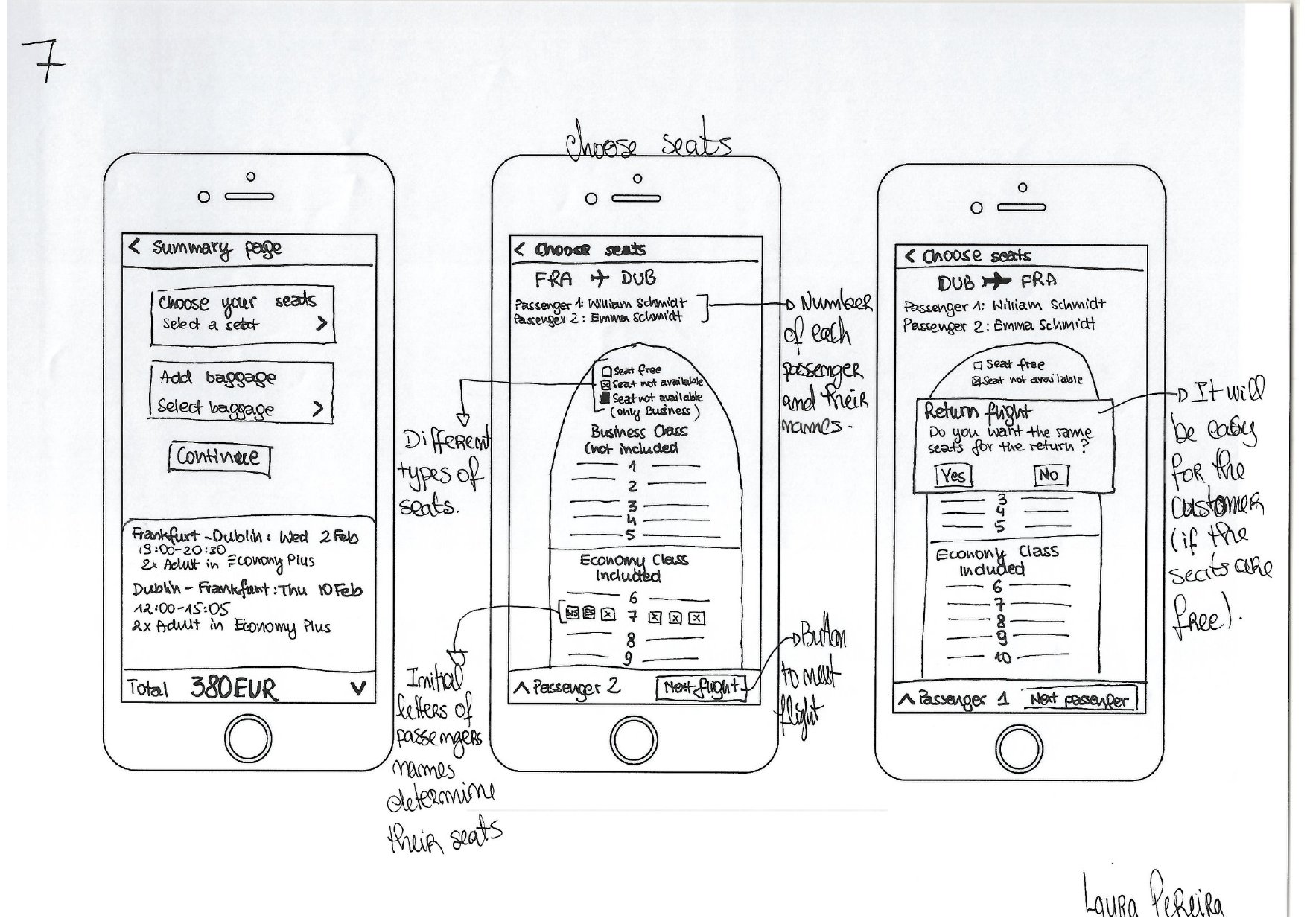
Wireframes
Duration: 2 Days Tool: Figma
Details needed by developers to build the application accurately.
The main objective of this project was to create a set of wireframes based on all the previous work which contained all the necessary details, controls explanations, rules and feedback a developer would need to build the application correctly.
Wireframes